Porto
An identity should have room to grow.
A city will always contain more stories than a logo can hold. Porto’s identity makes that abundance part of the design.
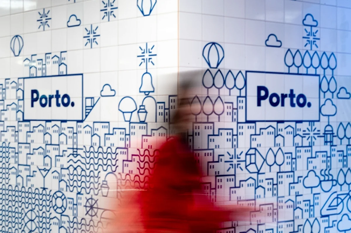
Ask a resident what defines their city and you might hear about a bridge. Ask another and you will hear about a market, a football club, a particular stretch of pavement. Cities are lived at different scales. The view from a tourism campaign is only one of them.
An identity has to give all that difference something to gather around. The difficult part is choosing a structure that can hold the place together without pretending the place is finished. Porto offers a useful answer: a vocabulary people can keep adding to.
Build a vocabulary from the place
White Studio’s 2014 identity, led by Eduardo Aires, drew on Porto’s narrative blue azulejos. More than 70 geometric icons formed a vocabulary of places, activities, and local references. The Porto. signature gave the city a compact anchor; the icon system gave it room for stories.
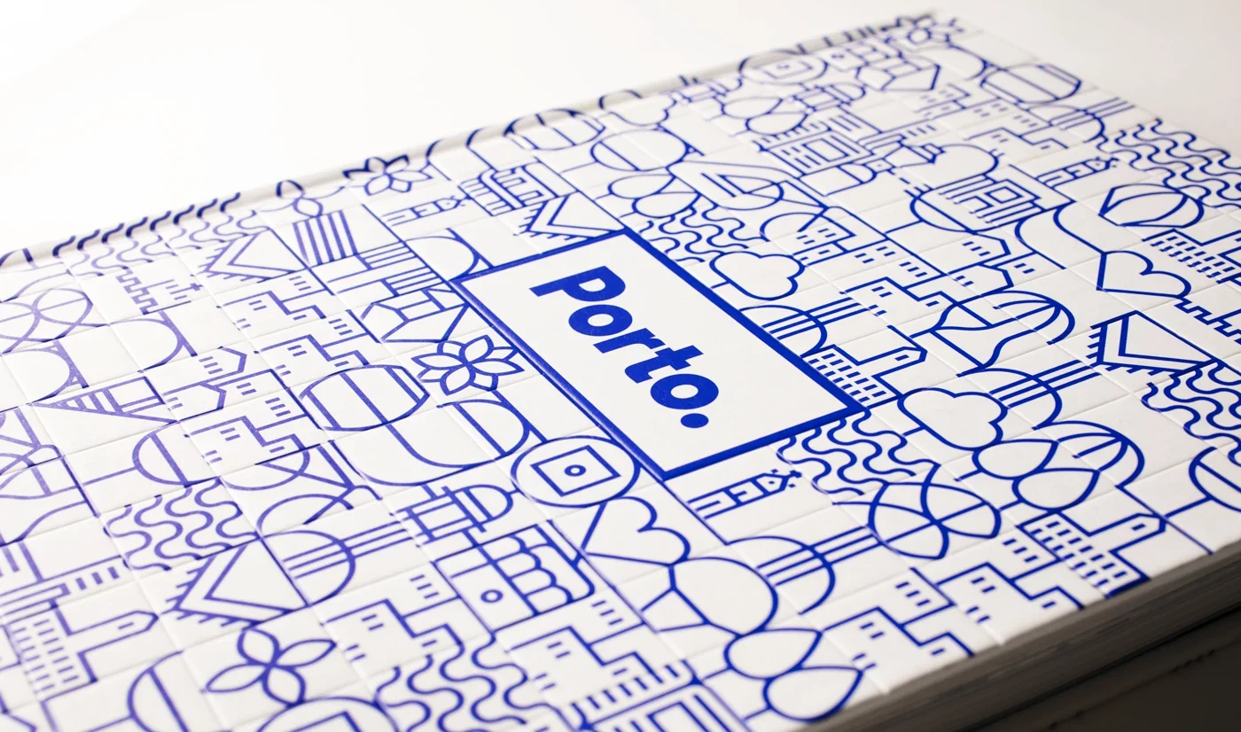
The source material matters. The blue-and-white language comes from something already present in the city. The identity changes its form, but retains a connection to the way the place has represented itself. That makes the visual system more grounded than a collection of interchangeable city symbols.
For a public project, I would look for this kind of connection before looking for a visual style. What forms, habits, materials, or ways of telling stories already belong here? Which of them can support a usable language without reducing the place to a souvenir?
Design how things join
The icons can sit alone, repeat, or connect into larger compositions. The connecting grid is what allows individual subjects to become a continuous visual field. It is the difference between collecting symbols and designing a language.
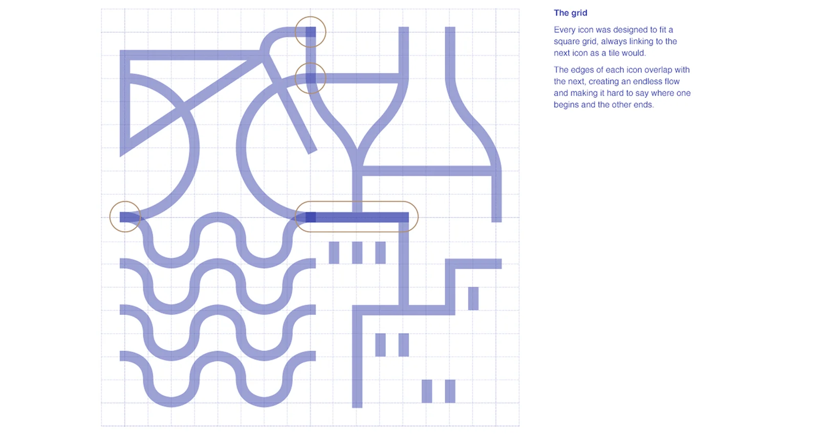
A collection grows by adding another item. A language grows by making another statement. That is a useful distinction when an organisation will keep producing new programmes. The system needs ways to combine existing elements as well as ways to admit new ones.
This asks for rules about relationships: line weight, density, connection points, scale, and the space around the signature. Those decisions may be less glamorous than the first icon, but they determine how much work the vocabulary can carry.
Leave space for the next story
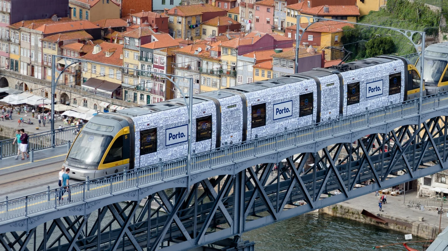
An identity can be complete as a design system and still incomplete as a catalogue. Porto’s designers explicitly describe a system that can accept new icons as the city develops. Its use across transport, public services, events, and urban furniture shows the breadth of situations it was designed to enter.
I find that a useful commissioning principle. Define the grammar carefully. Leave the subject matter open. The organisation should know how a new addition can belong without needing to know every addition in advance.
There is a catch. Open does not mean ungoverned. If anyone can add anything in any style, the language will gradually lose its character. Someone needs to decide what deserves an addition, check its construction, and put the approved version where others can find it. That is my practical reading of the case, rather than a claim about Porto’s internal approval process.
Commission for the thing you have not planned yet
Imagine a festival with a programme spanning music, film, food, and public talks. A set of beautiful launch posters may explain this year’s programme perfectly. It tells you less about what happens when next year introduces a children’s strand, a second language, or a temporary venue.
Ask the design team to make one of those unplanned applications before approving the system. Then ask someone else to make a second. You will learn where the language is clear, where it depends on the original designer, and where the rules have been mistaken for decoration.
A useful test can be small:
Put it to work
- Introduce a subject the original examples did not cover.
- Combine it with two existing subjects and the organisation’s name.
- Make it work on both a small digital card and a large physical surface.
- Record which decisions were obvious and which required help.
A city remains bigger than its identity
Visual coherence does not prove public belonging. A city identity can borrow local references and still miss people’s lived experience. The quality of the design and the quality of participation are related questions, but one cannot answer for the other.
For a municipality or cultural institution, I would keep asking whose stories enter the vocabulary and whose remain outside it. Can a new neighbourhood, community, or cultural practice become visible? Is there a route for people to challenge a representation that feels wrong?
A shared grammar is valuable because it can make room for difference. The test of that value comes when the difference is something the original brief did not anticipate.
Build the language carefully enough that the next story can join it. Leave the place free to keep becoming itself.
Sources & credits
Porto City Identity: White Studio / Studio Eduardo Aires, 2014. Art direction: Eduardo Aires. Design: Ana Simões and Raquel Rei; full team in the project archive.
- Studio Eduardo Aires: Porto City Identity
- D&AD: Identity for Porto
- Ana Simões and Raquel Rei: Porto project archive
- A city described through many connected symbols.White Studio / Studio Eduardo Aires
- Individual references become a shared visual vocabulary.White Studio / Studio Eduardo Aires
- The connections let individual references become larger scenes.Ana Simões and Raquel Rei / White Studio
- A shared language moving through the city’s everyday infrastructure.Studio Eduardo Aires
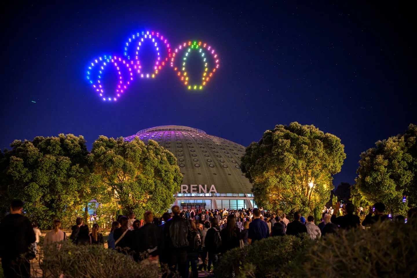
- The identity enters another setting in Porto’s 2024 anniversary celebration.Studio Eduardo Aires