MIT Media Lab
Different voices. One institution.
When every team needs a voice, making everything look the same is an expensive kind of silence. MIT Media Lab offers a more useful way to hold an institution together.
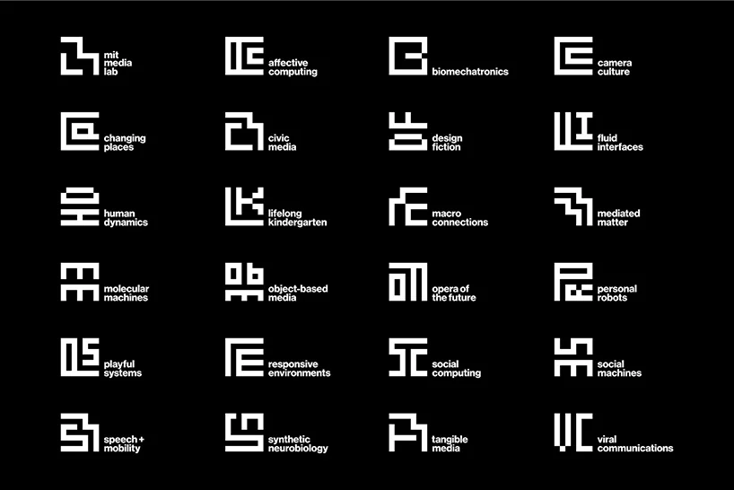
A research group wants its own identity. So does the education team. So does the annual festival. Each has a reasonable argument: different work, different audience, different ambitions. Give everyone complete freedom and the institution begins to disappear. Give everyone the same template and their differences disappear instead.
This tension turns up wherever an organisation contains more than one kind of work. It is tempting to settle it with a hierarchy of logos. I find it more useful to begin with the relationship. What should someone understand when they see these teams together? And what should remain theirs when they stand alone?
Put the consistency in the relationship
In 2014, Pentagram built MIT Media Lab’s ML monogram and a family of marks for its then 23 research groups on a seven-by-seven grid. The grid came from the Lab’s earlier anniversary identity. Helvetica supported the new family. These were designed glyphs, not a logo randomly regenerating itself whenever it appeared.
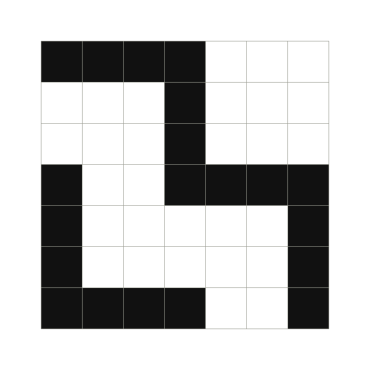
The useful move is where the resemblance lives. Each mark has its own letter combination and silhouette. But its construction belongs to the same world. A group can be distinct without needing to declare independence from the Lab.
That distinction matters. Repetition asks every part to wear the same face. A family asks the parts to share enough features for their relationship to be legible. The second approach gives you more room, but it also asks for more judgement. You have to decide which features carry the resemblance and which are free to move.
A grid is a boundary, not a designer
A construction rule cannot tell you whether a mark is good. It can narrow the field of decisions. The designer still has to choose a form that reads, balances, and holds up beside its neighbours. A family can obey the same grid and still contain an awkward relative.
This is where discussions about systems often become too neat. We talk as though defining a rule removes the need for taste. In practice, it gives taste somewhere to work. Instead of debating every decision from the beginning, the team can focus on the decisions that are actually open.



For a cultural organisation, that might mean a shared way of setting the institution’s name, a consistent relationship between programme title and venue, or a recognisable image frame. The construction should follow the problem. A square grid makes sense for these glyphs; it is not a prescription for every institution with several departments.
Belonging has to survive use
The Lab’s building directory moves the identity from a family of symbols into a practical setting. Here, the marks sit beside names and help organise a place. They are part of an information system, rather than an isolated exercise in resemblance.
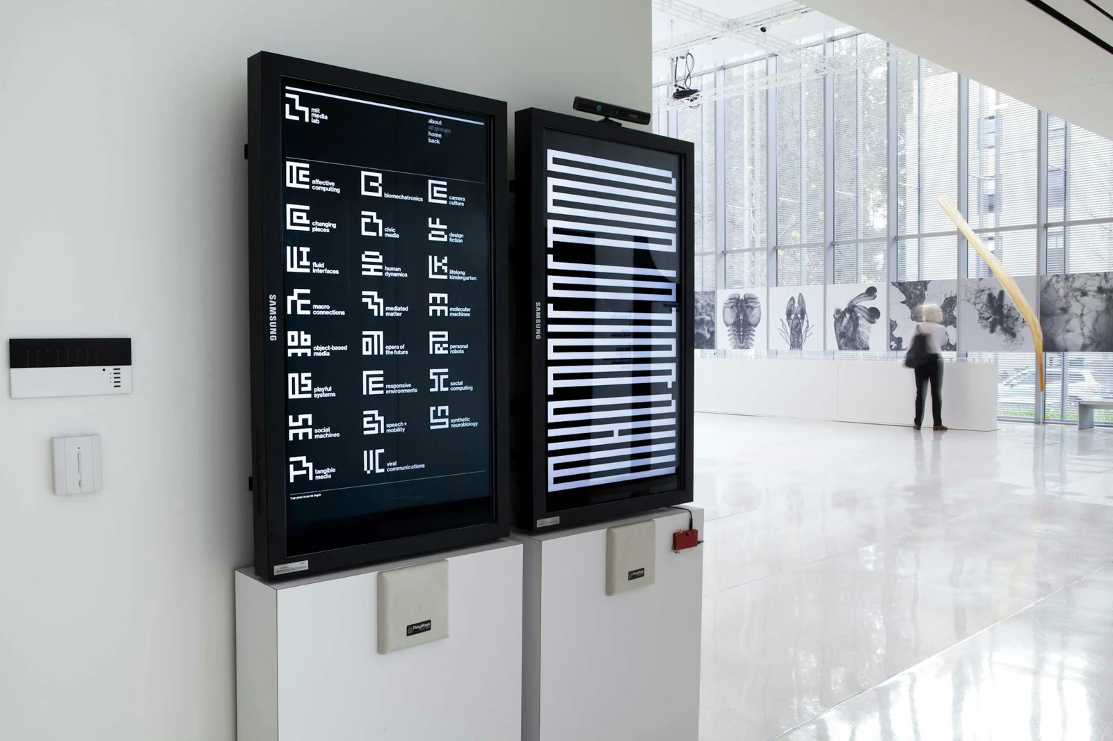
I would test a proposed family at exactly this point. Put three programmes next to one another on a website. Put one on a small ticket. Add a long title, a partner mark, and a photograph the team did not choose. Does the institution still feel present? Can the audience still tell the programmes apart?
A presentation of perfectly balanced marks answers only the first, easiest question: can the system look good when its inputs are controlled? The harder question is whether the relationship remains clear when the work starts arriving.
Begin with the family you actually need
Before commissioning a new identity, list the parts that genuinely need a distinct voice. Include the ones likely to arrive next year. Then describe why someone needs to recognise each part separately. An internal reporting structure is not automatically a useful public brand structure.
A programme might need a name and an editorial treatment rather than a separate logo. A long-running institution within an institution might need something more substantial. These are different jobs. Treating them all as the same job creates either needless complexity or a template stretched past its limits.
I would ask a team to work through four decisions before drawing the family:
Put it to work
- What must audiences recognise as belonging to the whole?
- Which differences help audiences choose, navigate, or understand the work?
- What shared construction can carry that relationship across real applications?
- Who decides whether a new programme needs a new mark or an existing treatment?
Count the cost of the next addition
There is a maintenance cost to every new identity. Someone has to draw it, name it, check it, explain it, and make it work at the sizes the organisation uses. A flexible family is useful when that effort buys meaningful distinction. It becomes cumbersome when every initiative is promoted to the same status.
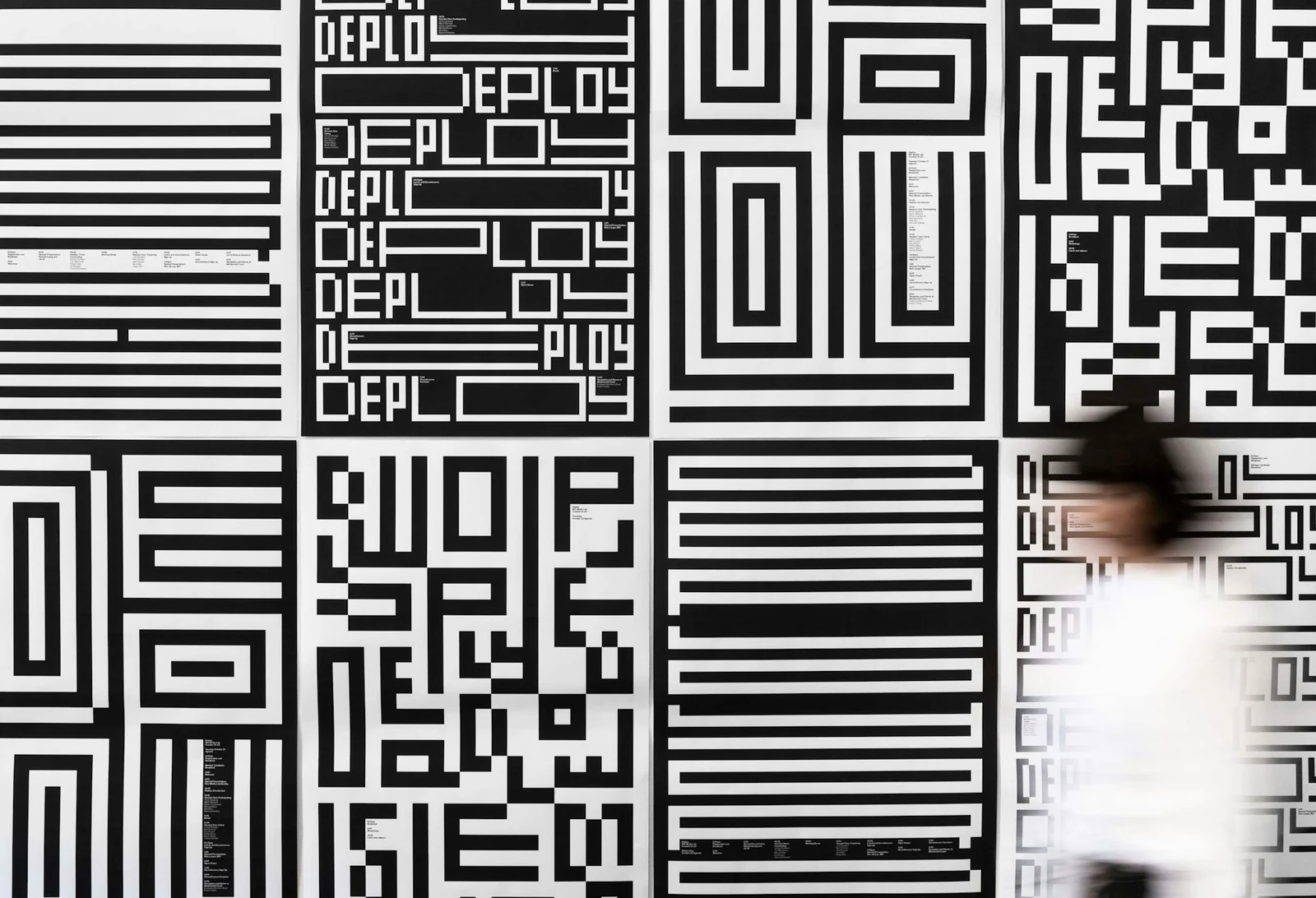
The aim is not to make an organisation look more complex than it is. It is to make its actual complexity easier to understand. The audience should see the connection without having to study the organisation chart.
Give the parts room to speak. Give people a way to hear that they belong together.
Sources & credits
MIT Media Lab identity: Michael Bierut and Aron Fay, Pentagram, 2014. Earlier anniversary identity: Richard The and Roon Kang.
- Different research groups, visibly related through a shared construction.Pentagram; group array via designboom
- The ML monogram on its seven-by-seven grid.ML monogram: Pentagram; construction overlay: Ahmed Elbeiti
- Camera CultureMIT Media Lab / Pentagram
- Mediated MatterMIT Media Lab / Pentagram
- Playful SystemsMIT Media Lab / Pentagram
- The family becomes a way of organising information in a real space.Pentagram
- The same construction extends into Deploy, the Lab’s 2014 launch event.Aron Fay / Pentagram