Whitney Museum of American Art
Make room for the art.
Every exhibition brings a different world. The institution needs to remain recognisable, but the art should not have to reshape itself around the brand.
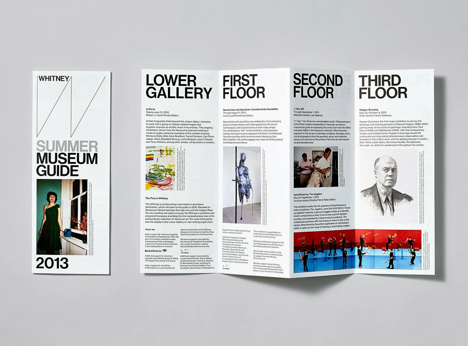
A painting is wide. The next is tall. One exhibition arrives with a single compelling image; another needs words to explain why the work belongs together. The season changes, and the design team starts negotiating space again.
This is a structural condition of cultural work. The programme keeps moving while the institution has to remain present. A rigid template can make the organisation consistent at the cost of the work. Total reinvention can serve each exhibition while leaving audiences with little sense of the place connecting them.
The Whitney’s identity interests me because it takes that negotiation seriously. It gives the institution a voice that can change its level of presence. There is room for the art, and room for the person arranging it.
Let the content establish the conditions
Introduced in 2013, Experimental Jetset’s identity uses a responsive W-shaped line. The designers describe placing an artwork at its original proportions, then allowing the W to respond to the remaining space. The Whitney name and typography provide other points of continuity.
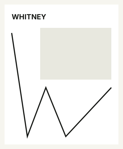
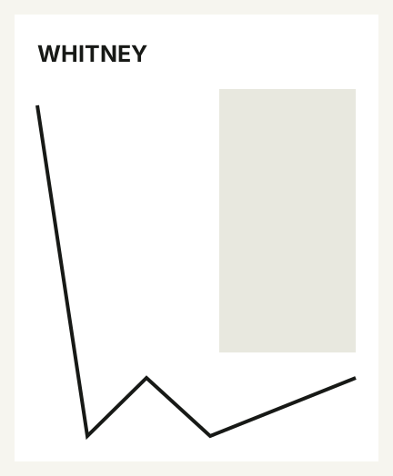
The order is consequential. The artwork does not first have to fit a fixed branded window. The identity takes account of what the work needs, then finds its own place. The relationship is repeatable even when the arrangement changes.
For a museum or gallery, this gives the design team a different starting point. Rather than asking how to force this image into the usual layout, they can ask what arrangement protects the image and still carries the institution. The work becomes a condition of the design instead of an obstacle to it.
Flexibility needs something to lean on
If everything changes, recognising the institution becomes harder. A flexible identity needs anchors: features that carry enough continuity for the rest to move. The name, typography, and recurring line give this system a structure around which different compositions can develop.
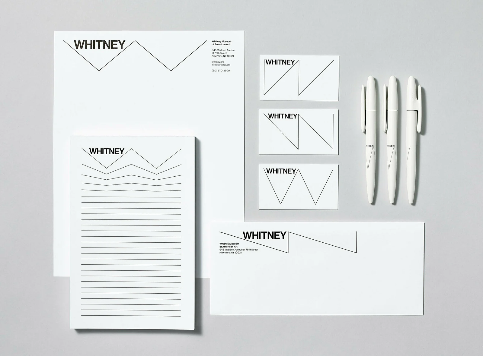
The useful question is how much those anchors need to do. A very expressive device may allow other elements to become quieter. A restrained mark may need more help from type, spacing, or editorial voice. You have to judge the whole relationship rather than assessing each element as though it were working alone.
I would test recognition across several genuinely different exhibitions. Do the communications still belong to the same institution when the imagery, title length, and mood change? If the answer depends on making everything identical, the system has not yet found its range.
Give the identity a volume control
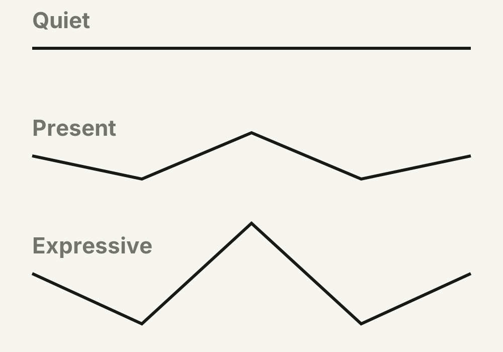
In their interviews, Experimental Jetset explain that the W can become more or less pronounced, even collapsing into a flat line. That ability to lower its presence is one of the most useful parts of the case. Recognition need not demand the same amount of attention in every setting.
A launch announcement might benefit from a strong institutional gesture. A detailed artwork reproduction might need something gentler. A visitor guide has to carry information. The design should be able to respond to the job without appearing to abandon the identity.
I would make three applications from the same content: quiet, present, and expressive. Then ask the team to explain when each is appropriate. If they can only say which looks better, the system needs a clearer account of what the change in presence is for.
The team is part of the system
The Whitney credits Experimental Jetset with designing the identity and its own Graphic Design department with producing the launch materials. That distinction is worth keeping visible. The agency supplies a language. The people inside the institution turn it into a continuing body of work.
A system that leaves room for judgement also needs people equipped to exercise it. That means examples with reasons, usable files, time to learn, and a route for discussing difficult applications. Flexibility can become an unfair burden if the brief promises it but the handover gives the team little support.
This is a commissioning question as much as a design question. Who will use the identity next season? What can they already do well? Where will they need a tool, a rule, or a conversation? The handover should respond to those people as carefully as the visual language responds to the art.
Approve next season, too
Before approving a cultural identity, test it against a programme that differs from the launch. Use a tall artwork, a wide one, a text-led exhibition, and a partnership that needs several credits. Ask the team likely to use the system to make at least one of these applications.
I would use four questions to guide the review:
Put it to work
- Can the work keep its proportions and required context?
- Can the institution remain recognisable across very different shows?
- Can the identity become quieter when the work needs more space?
- Can the team explain what stays fixed and where they are free to decide?
The next exhibition should become easier
A new identity can create excitement and still leave the daily work harder than before. More devices, more exceptions, more approval rounds. The cost is borne by the team every time the programme changes.
I would judge the system partly by the quality of those ordinary days. Does it help people protect the work, make a clear composition, and reach a decision they can defend? Does it allow different exhibitions to feel different without making the institution vanish?
There will always be judgement. The design should give it better ground to stand on.
The art keeps changing. A useful identity gives the institution a way to move with it.
Sources & credits
Whitney graphic identity: Experimental Jetset, 2013. Applications: Whitney Museum’s Graphic Design department. Photography: courtesy Jens Mortensen / Whitney Museum.
- Whitney Museum: A New Graphic Identity
- Experimental Jetset: Whitney Graphic Identity
- Experimental Jetset: The Whitney Tapes
- A recurring institutional voice, arranged around the work it presents.Experimental Jetset; Whitney Graphic Design department. Photo courtesy Jens Mortensen / Whitney Museum
- A wide artwork leaves a different space for the W.Diagram: Ahmed Elbeiti, after Experimental Jetset
- A tall artwork changes the remaining space.Diagram: Ahmed Elbeiti, after Experimental Jetset
- The museum’s in-house team makes applications from the shared language.Experimental Jetset; Whitney Graphic Design department. Photo courtesy Jens Mortensen / Whitney Museum
- The W moves from a quiet line to a more expressive presence.Diagram: Ahmed Elbeiti, after Experimental Jetset