Spotify
How do you brand what you don’t make?
Artists arrive with their own images, histories, and visual worlds. A platform has to hold them together without treating their differences as a problem to erase.

The image arrives late. It was made by someone else, for another purpose, at a size nobody requested. It still has to go on the poster by the end of the day.
This is ordinary life in cultural communications. A festival receives artist portraits. A publisher receives covers. A gallery receives artwork documentation. The organisation has a visual identity, but much of what it publishes comes from outside it. The identity has to meet the material where it is.
Spotify’s 2015 work with COLLINS is useful because it places that encounter near the centre of the system. The question is familiar: how do you make the platform recognisable when the image belongs to someone else?
A treatment that can receive different images
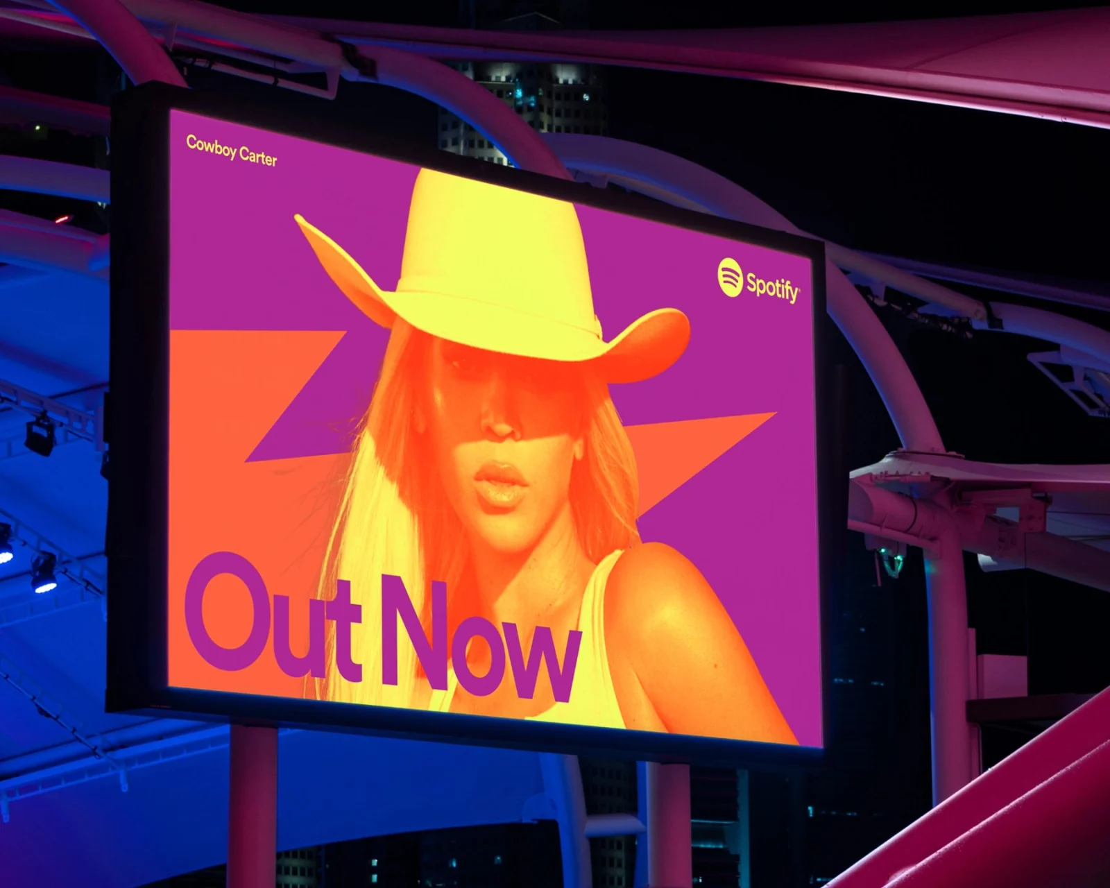
COLLINS describes its Lens as a duotone treatment for third-party artist photography, drawing on music’s screen-printing history. Alongside bold, high-contrast colour pairs, it offered a way to bring different photographs into a shared visual world.
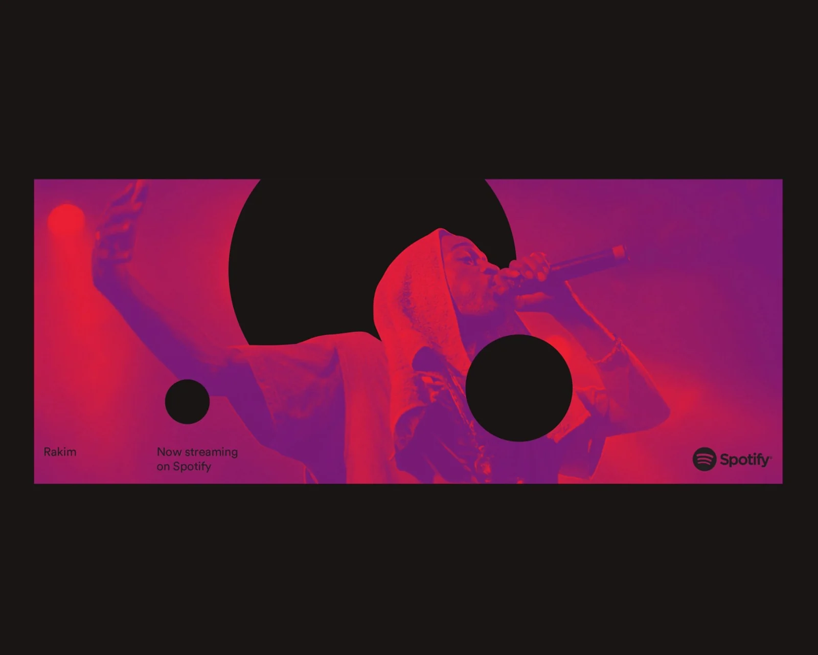
The useful shift is from controlling the image’s origin to designing what happens when it enters the platform. The subject and composition can differ. A recurring treatment gives the host a presence across those differences.
This is more adaptable than relying on every contributor to commission a photograph in the same style. It also moves the burden of consistency to the publishing team. They need a treatment they can apply reliably, and a way to judge when applying it would damage the material.
The relationship can matter more than the swatch
A palette is often presented as a list of approved colours. The Spotify case directs attention to how colours behave together. High contrast, unexpected pairings, a particular energy: the relationship becomes part of the identity.
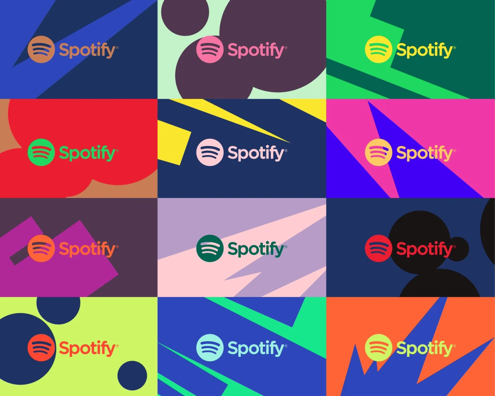
That gives a team more room than one prescribed pair. It also asks for more specific guidance than a large selection of swatches. Which combinations work behind a face? Which hold small type? Which become muddy when printed? A colour system earns its flexibility through those decisions.
For a festival, different strands might use different pairings while sharing the same approach to image, type, and contrast. The audience can register a change of mood without encountering a completely new organisation every time.
An image treatment changes the image
A duotone photograph is an interpretation. Colour information is removed or remapped. Mood shifts. Some details gain emphasis and others recede. The transformation can be useful for a portrait and entirely wrong for a work whose colour is essential to its meaning.
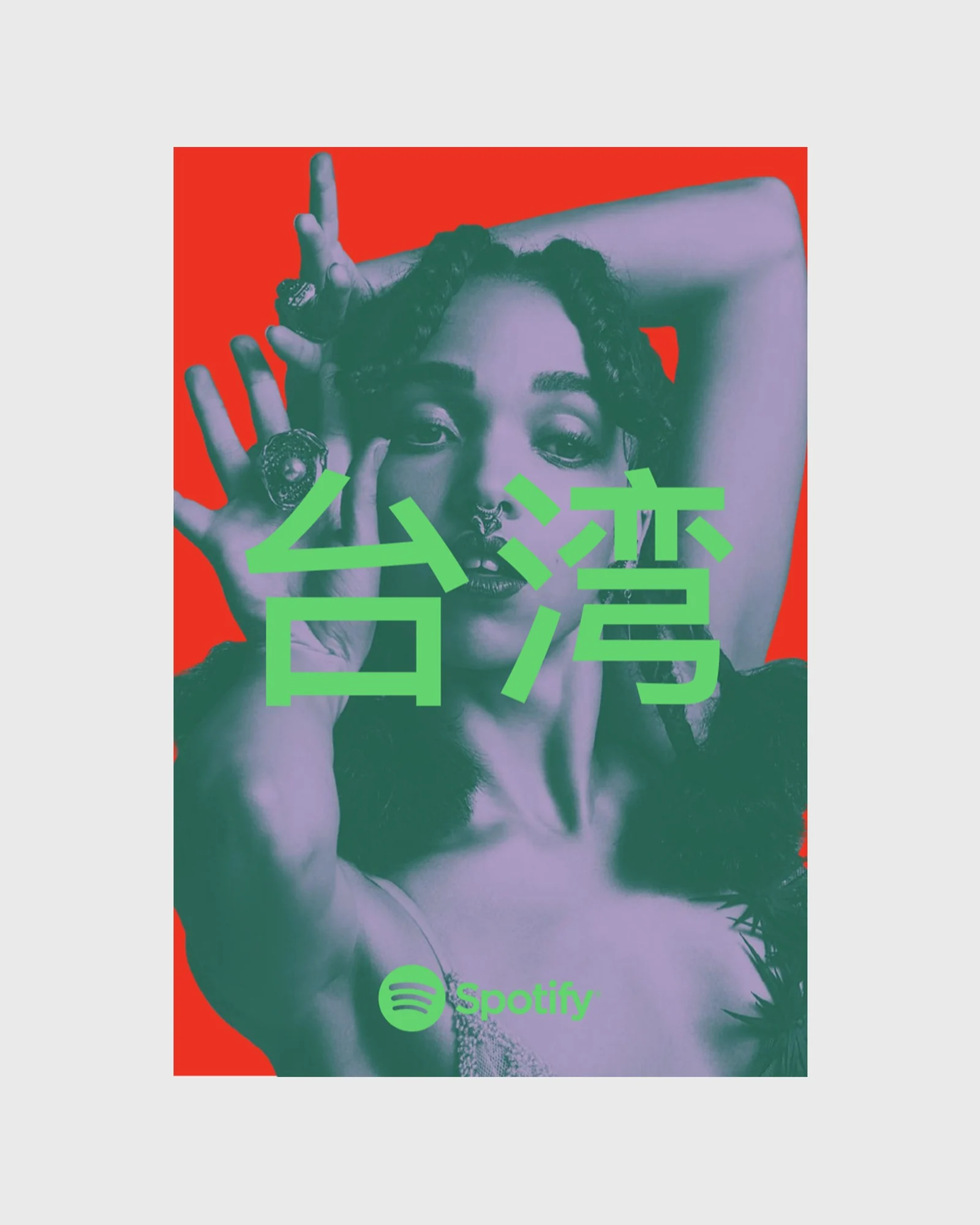
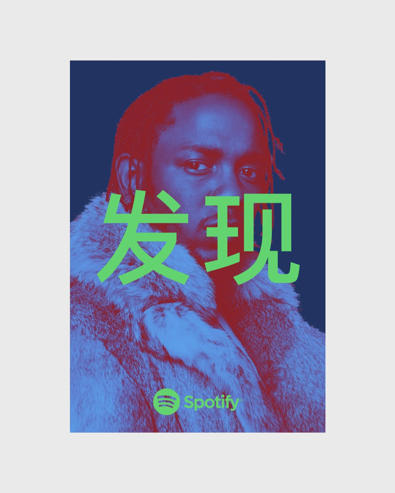
This is where the brand team needs to know what it is handling. An artist portrait, a painting reproduction, a film still, and a documentary photograph do not carry the same permissions or obligations. A technique that works beautifully in one context should not become an automatic answer to all four.
I would define a boundary alongside the treatment. What can be cropped? What must retain its original proportions? When does colour need to remain accurate? Who approves an alteration? These are editorial decisions with visible design consequences.
The point is to make the encounter intentional. A cultural platform should have a recognisable voice and a clear understanding of where that voice needs to make space for another author.
Design the arrival of the material
The template is only one part of this system. The other part is the process through which the image arrives. If the team spends every launch chasing credits, usage details, and a file large enough to print, the identity will keep absorbing problems that began before layout.
A practical image intake can ask for the original file, the required credit, permitted crops and treatments, and a contact for approval. Provide contributors with a clear explanation of how their material may be used. Keep the untouched original beside the prepared asset.
These sound like small administrative choices. Together they give the designer a more dependable field of decisions. The team can spend less time guessing what is allowed and more time making the work good.
Try the images that do not cooperate
Test the system with material your organisation is likely to receive: a dim portrait, a busy group photograph, a landscape still, a brightly coloured artwork, and a low-resolution archive image. Beautiful source material can make a fragile treatment look robust.
For each image, ask whether the subject remains legible, the credit remains findable, and the organisation still feels present. Then ask whether a faithful reproduction should use a quieter frame instead of the full treatment.
A useful image system needs more than a signature effect. It needs a default, a considered exception, and a person who can tell the difference.
Put it to work
- Define what the material must retain before choosing what to change.
- Test both image legibility and text contrast in the actual output sizes.
- Make a restrained fallback for images that should remain untouched.
- Document the reason for using the treatment or choosing the exception.
The identity has to receive the work. How carefully it does that becomes part of what the organisation stands for.
Sources & credits
Spotify identity: COLLINS, 2015. All case imagery from the COLLINS project gallery, which includes applications from different periods.
- A photographic subject enters a recognisable colour treatment.COLLINS for Spotify
- The treatment brings a different photograph into the same visual language.COLLINS for Spotify
- Variation in colour can still carry a recognisable behaviour.COLLINS for Spotify
- One photograph, a pink and green treatment.COLLINS for Spotify
- The same photograph, a blue and green treatment.COLLINS for Spotify
- The visual language carries into a physical campaign space.COLLINS for Spotify